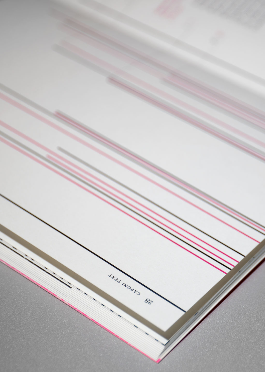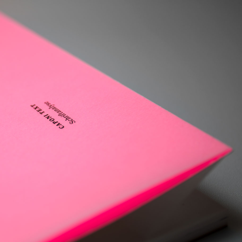
Caponi Text
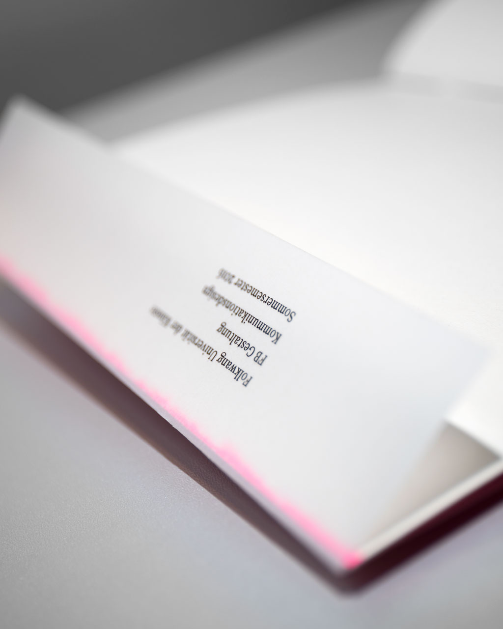
Term paper 2016Font analysis
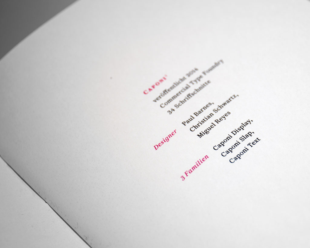
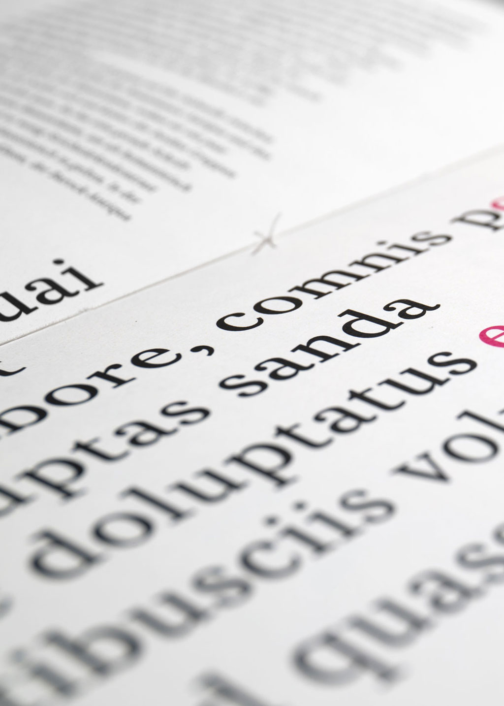
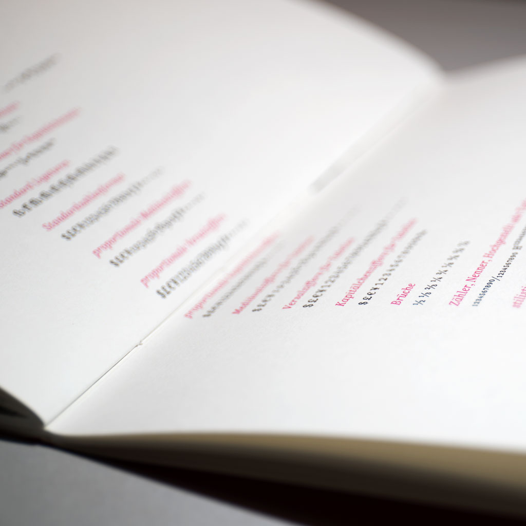
The magazine contains a detailed analysis of the writing font Caponi Text by Christian Schwarz and Paul Barnes. In the term paper the readability and suitability for a text body by means of the x-height, the shade of grey and the architectual details, of the baroque antiqua is analysed. The font family of the Caponi (Caponi Text, Caponi Slab, Caponi Display) was orgininally developed for the 20th anniversary of the magazine Entertainment Weekly for shorter infotexts and was inspired by the early and dynamic fonts of Giambattista Bodoni. The magazine is exclusively set in Caponi Text. The colouring and the markups are reduced to a minimum, to guide the readers attention towards the important details.